The final Urbis exhibition, Urbis has Left the Building, manifests the same symptoms as many shows I have seen at Urbis. There is no argument, no nuance, no exciting interplay between objects or images. Just one side of the story is told, and hammered home with every item and every curatorial technique to hand.
Reading Jonathan Jones' blog on criticising institutions, I feel reassured that I'm right to notice that Urbis has never provided the intellectual jungle gym I am looking for. Even the exhibitions which should have been delightfully jam packed with objects and images, just used them to heavy-handedly support one rhetorical point of view. Urbis may have presented little seen aspects of popular culture, but when they were told with such stifling hagiography how could we expect the vibrant, complex and conflicted nature of popular culture to emerge?
So what? This exhibition is the story of Urbis told in the Urbis style. It's boisterous and blustering, a perfect essay in corporate PR. Relying on exhibition posters to tell it's own story, it does serve to remind me of everything I have experience in that glassy wedge.
The first exhibition I went to at Urbis was the advertising one in 2008. It was unquestionably terrible, a bit of professional propaganda which rightly had no place in a publicly funded building. Looking at the poster for the D&AD Advertising & Design exhibition I felt like pointing a finger at it and shrieking "SHAME! SHAME!" in a manner combining both Donald Sutherland at the end of Invasion of the Body Snatchers and an early American puritanical witch hunter.
If you love Urbis, Urbis has Left the Building is a one dimensional retrospective you might enjoy. But if you are looking for an honest, thoughtful and thought provoking exhibition, go somewhere else. Urbis may have tried to do something incredibly difficult, but that is no justification for the dangerous simplifications it habitually employed.
Am I sad to see it go? A little... the failure of Urbis may discourage future attempts to present popular culture, it's perceived successes perhaps encourage simplistic, dictatorial curatorial practises and, as I've previously commented, sets a dangerous precedent for how we deal with cultural institutions when they don't meet predefined standards of success.
Sunday, 24 January 2010
Thursday, 21 January 2010
Bored of Banksy...
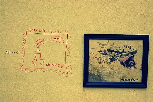
There is nothing quite like fame to influence how we interpret art... apart from perhaps knowing how much it cost. The problem with the former is that reputation often has little to do with the actual quality of what is perpetrated in the name of art. Often indistinct and always inescapable, our obsession with artists personal history and reputations distort, and sometimes positively obstruct, the way we see.
Our at once both clingy and contentious relationship with Banksy is a perfect case in point. He’s been floating high on his vast profile, inflated by huge belches of hot air from the media and middle class, for a decade or so.
The problem is that his profile is several time more interesting than his art. At the core his art actually has very little substance. When you’ve identified the, frankly not very well concealed, tropes it can - a bit like a Terry Pratchett novel - get a tad boring. Think about your favourite Banksy piece and count off these factors: It’s dependent on simple visual gags, a peripheral understanding of some basic art concepts and a rather churlish teenaged set of politics.
On the street Banksy catches the mainstream audience eye because the works sit in a context of street painting that is still essentially highly exclusive, expressly holding meaning for a tiny marginal group of people, and, unlike Banksys, has little regard for traditional aesthetics. To 99% of the population graffiti is the kingdom of the blind, Banksy just happens to be the one eyed man.
That doesn’t mean he’s up to sitting at the proverbial grown up table. In the gallery or the print fare he is like a clever teenager who’s been allowed to stay up past his bedtime. His gallery works are almost comforting in the way they both manage to be ever so clever and yet cleave to the well established Banksy form. They only hold our attention because of his reputation, because we are all the artistic equivalent of rubber neckers at a grusome car crash. We look to Banksy because we want that tart taste of controversy and novelty. However, when he hold so closely to form, surely whatever controversy his exhibitions might hold quickly disperses? What is exciting about art that always manages to perfectly meet our expectations?
If you look at his original print works, and the prices they fetch in the auctions and print fares, it becomes pretty clear that he is simply replicating one aspect of Warhol’s career without one ounce of Warhol’s brilliance. More so than Warhol, Banksy proves variations on a theme can only be applied for so long before becoming insufferably stale.
So although Banksy is still consistently popping up in the news - images appearing over night on walls all over the world, purchased at some ridiculous price by whatever celebrity we are supposed to idolise now, jealously being vandalised or white washed over by thick thumbed councils - isn’t it time we got over him? Come on! lets all makes a critical resolution for the New Year and try from now on to extract the artist’s reputation from the art and actually look at what is in front of us?
You liked this! It was published in The Blog Paper No. 3
Image by Walt Jabsco used under a Creative Commons Licence - check it out on Flickr
Monday, 18 January 2010
Aubrey Williams: Atlantic Fire @ Walker Art Gallery
Does great art need to defy or define the period it was created in?
When mooching in the Walker Gallery, it's always hard not to stop and gaze at the Turner located just by the glass doors to the Special Exhibitions . A shimmering, gleaming seascape, it is both a magical abstraction and a perfect evocation of an effect of heat, light and water.
Turner is basically the definition of great art, so it's both tempting and slightly cruel to compare anyone to him. However, I've found it difficult not to dwell on this comparison when visiting the recently opened Aubrey Williams: Atlantic Fire.
Aubrey Williams, Hymn to the Sun IV, photographs from National Museums Liverpool flickr page.
Aubrey Williams' paintings are both very beautiful... and somewhat kitsch. What stops them being sublime is an unfortunate combination of muddy and electric colours which lends them a certain 80s air. I know this is an inherently ridiculous criticism, but it bothers me. Where I want his miasmic coral like colours and forms to shimmer and billow, there is an rubbery quality somehow reminiscent of marbled paper.
But can I really criticise paintings made in the 80s for looking like products of their time? I feel uncertain on this point. At the end of the day, not everyone can be Turner.
Wednesday, 13 January 2010
Reinventing William Blake
‘And who was this William Blake? A wild sort of painter, was he not; or a poet of some kind; and at any rate, a strange sort of man?’*
The problem for rabid art bitches like me is that you can't dismiss the man. Although mired in a sea of preconceptions and substantial accusations of Blake's paucity of theory, skill and sanity, his contortion of the human form and mangling of the British language are rather exciting. Perceived in so many ways to be the teenaged pinup of a mad artistic genius, this authorship of the man in the most offensive thing about him.
Just as the Frida Khalo we know is a creation of second wave feminist art history, William Blake was created by the Victorian generation that followed him. The smoothing of Blake's hymns into the form of Jerusalem we know now took place in the Edwardian period and can be directly traced back to the work of Blake's Victorian lobbyists.
The Tate's purchase of 8 prints, some of them only exhibited once before, will be getting the teenager in every art fan tumescent. But it's also bringing out a lot of tired truisms and urban legends about the man. I would not argue that we should attempt any impossible mission into the impenetrable mists of time to discover the "real Blake", just perhaps accept a slightly more tempered approach to the man.
At the end of the day, is it really acceptable that respected and widely circulated sources such as the Guardian air the largely dismissed fantasy that Blake "sat naked in his London garden with Catherine, emulating what he saw as the lost innocence of Adam and Eve" as fact?
*John Camden Hotten caricaturing general public understand of Blake in, Review of ‘William Blake; A Critical Essay’, Illustrated Review, 1:13 (1871:Apr.), 436.
Tuesday, 12 January 2010
Rothko's Seagram Murals @ Tate Liverpool
It may be old news, but there is something magical about Rothko's Seagam Murals. Although magical is not quite the right word, it's too light and sparkly for a sequence of works which are muscular, dense and crackling with some serious psychological juju.
I've never been a fan of the Tate Modern in it's current form, it's a big ugly, hard edged, over branded art box. But, when I lived down south I used to almost religiously visit the murals, which, like Chris Ofili's wonderful The Upper Room, are dripping with a powerful cloistral quality. You can't really look at these works, just point your face in the direction of the painting and bath your brain in their amazing hues and textures.
Now at the Tate Liverpool, a smaller, more colourful but still hard edged venue, The Seagram Murals have found a situation which is not only appropriate but even better than the Tate Modern. The industrial pillars, flagstone floor, gently vaulted roof lends a delicious industrio-spiritual flavour to what was previously simply a dimly-lit grey room.
A visit to see The Seagram Murals is like a visit to see an old friend... if that old friend is a succulent and slightly unsettling art experience.
Wednesday, 6 January 2010
Bleakest snow scenes? The Victorians did it best!
My intellectual crush on Jonathan Jones can only grow. What else can I do when his most recent blog resonates with my artistic interests even more than usual. However, I do have to disagree with his choice as the bleakest snow scene.
I’ve written more words than I care to think about scenes of ice and snow, spent months of my life studiously dissecting the representation of Victorian polar explorers. These silly men who set the trends for the equally silly Edwardian explorer Robert Falcon Scott have always fascinated me. The most famous and bloody of the Victorian explorers is John Franklin, who through being unprepared to the point of delusion managed to star in a story bursting with death, misadventure, cannibalism and powerful Victorian rhetoric. This gristly story left deep scars on the Victorian psyche, and these scars show in numerous snow filled paintings.
Mr. Jones picks a scene of massacre as his bleakest snow scene. It’s a powerful painting represented a horrendous scene, but can it really match the subtle, painful hints of disaster that appear in Landseer’s Man Proposes, God Disposes? Here Landseer makes masterful use of artistic techniques that we are more used to see manifesting themselves as nauseating Victorian pathos. Russell Potter wrote a brilliant blog post unpicking this interesting painting on Visions of the North.

Honourable mention must also go to Thomas Smith’s They Forged the Last Link With Their Lives in the National Martime Museum. (I’m not sure why they’ve changed the name of the piece since I wrote about it three years ago, since it categorically couldn’t represent Franklin). The painting shows the last surviving men of the ill fated expedition dead and dying in a bleak and hopeless tableaux. Unquestionably, when considering the now generally accepted accusations of cannibalism between the survivors, it does work as a piece of propaganda, but it also shows the end of an almost unimaginably terrible narrative.

For people in the North West looking for a scene of snowy bleakness which could rival the streets of Manchester, a trip to the permanent galleries in the Manchester Art Gallery might be in order. This time not about explorers, but about Napolean’s retreat from Moscow. A narrative scene over flowing with the futility and bleakness of war, I find Adolphe Yvon’s Marshal Ney Supporting the Rear Guard During the Retreat from Moscow almost mesmerising. The detail is compelling, the moment when you notice the naked corpse - presumably stripped of his clothing by frost bitten comrades - is positively shocking.
So that’s it. Three paintings which both perfectly demonstrate the Victorian taste of macabre scenes set in frosty snow swept wastes and will perhaps lend a little context to our current snowy predicament!
I’ve written more words than I care to think about scenes of ice and snow, spent months of my life studiously dissecting the representation of Victorian polar explorers. These silly men who set the trends for the equally silly Edwardian explorer Robert Falcon Scott have always fascinated me. The most famous and bloody of the Victorian explorers is John Franklin, who through being unprepared to the point of delusion managed to star in a story bursting with death, misadventure, cannibalism and powerful Victorian rhetoric. This gristly story left deep scars on the Victorian psyche, and these scars show in numerous snow filled paintings.
Mr. Jones picks a scene of massacre as his bleakest snow scene. It’s a powerful painting represented a horrendous scene, but can it really match the subtle, painful hints of disaster that appear in Landseer’s Man Proposes, God Disposes? Here Landseer makes masterful use of artistic techniques that we are more used to see manifesting themselves as nauseating Victorian pathos. Russell Potter wrote a brilliant blog post unpicking this interesting painting on Visions of the North.
Honourable mention must also go to Thomas Smith’s They Forged the Last Link With Their Lives in the National Martime Museum. (I’m not sure why they’ve changed the name of the piece since I wrote about it three years ago, since it categorically couldn’t represent Franklin). The painting shows the last surviving men of the ill fated expedition dead and dying in a bleak and hopeless tableaux. Unquestionably, when considering the now generally accepted accusations of cannibalism between the survivors, it does work as a piece of propaganda, but it also shows the end of an almost unimaginably terrible narrative.
For people in the North West looking for a scene of snowy bleakness which could rival the streets of Manchester, a trip to the permanent galleries in the Manchester Art Gallery might be in order. This time not about explorers, but about Napolean’s retreat from Moscow. A narrative scene over flowing with the futility and bleakness of war, I find Adolphe Yvon’s Marshal Ney Supporting the Rear Guard During the Retreat from Moscow almost mesmerising. The detail is compelling, the moment when you notice the naked corpse - presumably stripped of his clothing by frost bitten comrades - is positively shocking.
So that’s it. Three paintings which both perfectly demonstrate the Victorian taste of macabre scenes set in frosty snow swept wastes and will perhaps lend a little context to our current snowy predicament!
Subscribe to:
Posts (Atom)