Sunday, 19 December 2010

Nam June Paik @ Tate Liverpool & FACT

Something magical is happening in Liverpool... and I don’t mean the snow or the Christmas spirit.

Split across the Tate Liverpool and FACT, Nam June Paik is receiving a very well deserved retrospective. Even though he may not be universally well know, he’s a seminal artists, and there is more than enough artistic ammunition to prove this as gospel truth.

Nam June Paik seemed to consistently produce provocative, assessable artwork without having to belabour a theoretical or political point. It is refreshing and enjoyable, and most importantly not at all worthy or good for you! This is delicious visual and intellectual bubble-gum, sustenance without nasty roughage.

In the Tate Liverpool, you find yourself stumbling from delight to delight. In TV Garden, 1974, a room bristles with tropical plants and flickering tv sets and feels like something out of the Terry Gilliam film Brazil. One Candle, 1988 - a video camera focused on a candle, with the image broken down into it’s constituent colours and projected onto the walls - is as beautiful as an abstract painting and lead you to ponder the very nature of light. Also... Robots!

This is not to mention Laser Cone, 2001, over at FACT. If you are lucky you’ll be able to enjoy this experience without aged hippies yelping that how it’s just like acid... but even with that annoying accompanying chorus it is sheer magic.You'll have trouble tearing yourself away from Laser Cone, and not just because being battered and bruised from falling over on the ice makes it hard to get up.

It shouldn’t be startling, but to find an artist who so consistently worked with such dazzlingly originality, ingenuity and integrity with mass technology is just that. It has driven home to me (again) how utterly jaded I am about technology and art; why did I even need to remark on the synergetic skill with which Rafael Lozano-Hemmer wove the two together? Because most artists simply have not been as good as this pioneer!

Nam June Paik has reminded us that art can be magical.

Nam June Paik in collaboration with Norman Ballard
Laser Cone, 2001/2010
© Estate of Nam June Paik and Norman Ballard
Photographed by Stefan Arendt, LVR / Medienzentrum Düsseldorf

Goodbye Don Van Vliet


If the name of this blog isn’t enough of a give away, the fact that I dedicated my MA dissertation to Don Van Vliet might indicate to you that I am a little bit of a Captain Beefheart fan girl.

With the recent death of Don Van Vliet (1941 to Friday 17 December 2010) I’m guessing a great number of copies of Trout Mask Replica are being dusted off. Now, don’t get me wrong, Trout Mask Replica is an alright album, just as his best known album it is rather overrated and frequently, even to my prog loving ears, unpalatable.

What’s probably not being said is that of this undoubted pioneer of mad, experimental rock music is that he was also an uncanny master of love songs.

Turn to songs like the adorable My Head Is My Only House Unless It Rains (The Spotlight Kid/Clear Spot), the bitter sweet Too Much Time (again The Spotlight Kid/Clear Spot, sadly not on Spotify) and the glorious rolling broken hearted ballad Love Lies (Shiny Beast (Bat Chain Puller)) and tell me I’m wrong. 

A while ago, I put together a Beefheart Love Song playlist on Spotify, sadly missing some real gems that are not available.

... and, it might not be a love song, but little can beat the swirling, foot tapping magic that is Yellow Brick Road for sheer musical manifestation of joy.

Saturday, 20 November 2010

Sound Relay ~ Long Night 2010

Photo from Liverpool Echo - see more on LiverpoolEcho.co.uk

In recent weeks - perhaps prompted by budget cuts, perhaps by the many wonderful musical and artistic experiences I've enjoyed - I've been thinking about how art and music provide an essential intellectual life.

As much as I'll defend anyone's right to enjoy Eastenders and Don't Tell The Bride (I'm guilty of both), little beats an exhilarating cultural experience.

Bearing these thoughts in mind you would think that music in art galleries would be a heavenly concoction... and indeed, done in the right manner, it is.

On Thursday night. Ensemble 10/10's (yes, I might have a vested interest here) performance of Jennifer Watson's Reflections, set amongst Magdalena Abakanowicz's Embryology, was simply magical. A quirky, vortical cascade of sound led by a delicious sounding soprano saxophone (not a "fat clarinet"), the piece didn't fall into any of the discordant pitfalls of contemporary classical music.

However - proving there are no absolutes - the rest of the Sound Relay at Tate Liverpool was a very different experience.

Self indulgent art and self indulgent music are seldom of the highest quality. While clattering about the streets of Liverpool after a cacophony of musicians is a lot of fun, the same cannot be said about musicians making the same sound scattered about a gallery space.

The joy of an art gallery is that the environment is tightly controlled, curatorially judged, not to make you buy stuff but to encourage reflective gaze and thought or to create atmosphere and evoke feeling. On Thursday night people in the gallery space just did not know what to do with themselves, look at the fine art or cast awkward regard at the buskers, and it was seemingly impossible to do both. The atmosphere was both oppressive and fragmented, simply put a balance had been disrupted.

Yes, there was novelty in having musicians in the gallery, but novelty is not enough! I'm not casting aspersions on the skill of the Sound Relay musicians, but rather the premiss that it was a good idea effectively executed. Perhaps I'm just not a fan of noodling?

In conclusion, live music in art galleries, not a bad idea. Just needs to be as carefully executed as the fine art and as curated as the gallery space.

Friday, 5 November 2010

The illustration of Tove Jansson


I was a lucky child. Unlike most of British children I wasn’t exposed the Moomins by creepy stop animated felt, Japanese cartoon interpretation or the slightly awkwardly written/translated novels. Looking at these versions of Tove Jansson’s creations, is it any wonder that illustrator Adam Cadwell included Moomin Papa in his list of childhood villains?

“It’s hard to describe but something about their vacant, piercing eyes and their emotionless, mouthless faces used to get me extremely worried and paranoid about what their true intentions were.”- Adam Cadwell

Fortunately for me, one my earliest memories is my mother reading to me in English - translating from Swedish - from Moomin, Mymble and Little My, the very edition she herself had owned as a child. This has recently be translated and reissued, and I feel so happy that British children will be exposed to this wonderful book. Yes, weird, but still utterly wonderful.

As adorable as the characters, narrative and prose created by Finnish-Swede Tove Janssson are, for me the real joy of the Moomins lie her original, delightfully quirky and innocently warped, illustrations. Like Maurice Sendak, or fellow Scandinavian Elsa Beskow, there can surely be little better than strange stories, exciting and engaging for the bizarre peril that permeates them, accompanied by beautiful illustration?

Anyway, what started me on this soliloquy of Moomin-love? Bury Art Gallery currently has an exhibition called Magical Moominvalley (23 October - 15 January 2011) celebrating Tove Jansson’s illustration. Get thee to Bury!

Monday, 11 October 2010

Recorders : Rafael Lozano-Hemmer @ Manchester Art Gallery

Until recently art that was substantively digital or technological seemed to jump one of either two way. It was technologically awkward, light years behind the actual advanced grace of contemporary technology, or it was unengagingly aloof, endeavouring to divorce technology from the throbbing warm of the human experience.

Thankfully this dichotomy is now over, art has finally caught up with technology, and we have artist who are brilliant technologists... or perhaps the other way round?

Recorders, Rafael Lozano-Hemmer's solo exhibition at Manchester Art Gallery (18 September to 30 January), brilliants elucidates the uneasy, but delicious, relationship between the body- and life-human and technology.

You are greeting by Pulse Index (2010), a work that perfectly embodies the playful, ominous, interactive ethos of the exhibition. The sight of your finger print, so ubiquitously human and essentially individual, enlarged in perfect definition, complete with tiny beads of sweat and grime magnified and glittering like pearls, is both delightful and viscerally shocking. It then flutters off to join the teeming, digitalised hoards of finger prints stored in the work.

As fascinating as all the installations are in this exhibition, none of the joyful wizardry evokes the sheer wonder and consternation of Pulse Room (2006).  The tension that runs through many of the works, that we are all uniquely identifiable humans and yet share essential innately-human functions, is illustrated by a constellation of heart-beat-flickering light bulbs. Standing in the darkened room, as a light bulb pulses in front of you with your own heart beat, followed by watching your rhythm flow and dissipate across the room, is just thrilling.

Recorders reminds you of your humanity, simultaneously evoking your biological uniqueness and your puny organic commonness, like a kindly robotic overlord.  This exhibition is delightful, if you are not too serious about art or technology. Ominous and playful, I feel as though Rafael Lozano-Hemmer's work is the first that I've experienced that accurately and beautifully portrays the mood, issues and joys of life in our ubiquitously- digitalised present and near future.


Recorders: Rafael Lozano-Hemmer from Manchester Art Gallery on Vimeo.

Sunday, 19 September 2010

Biennial @ The Europleasure / Scandinavian Hotel


As many people have commented, one of the wonderful side effects of the Biennial is the access to disused buildings, many that I've previously walked past without noticing. The Europleasure / Scandinavian Hotel, at the top of Duke Street, is one of those buildings.

You can't miss it now! At the front it is resplendent with Will Kwan's Flame Test and the words Touch and Go have been smashed into windows at the side.

I wouldn't have expected the real highlight of yesterday to be two completely dissimilar pieces of video art. We Wish to Inform You that We Didn’t Know,  a three-channel video work by Alfredo Jarr, offers compelling and harrowing, but not gratuitously so, insight into the atrocities in Rwanda. Even if you are familiar with the details, the video articulates emotions and facets that perhaps no written or purely documentary account could manage.

The video element of  Cristina Lucas'  Touch and Go couldn't be more different. At counterpoint to We Wish to Inform You that We Didn’t Know, the video offers a 'making-of' view of the buildings smashed windows. Humorous, in the gentlest and most charming manner, it is a bitter sweet story of urban transgression set to a delightful discordant sound track.

The works in this location are part of the Biennial's Public Realm strand.

Saturday, 18 September 2010

Biennial @ 52 Renshaw Street

The old Rapid buildings along Renshaw Street have been used for a variety of interesting purposes recently, but the Biennials residency in the space will take some beating.

The vast and warren-like space is cleverly spotted with art works, some of them good, some of them, frankly, extremely questionable. Unlike most vacant shops I've seen used as galleries, the space has not been white washed to death. Instead the curator, Lorenzo Fusi, seems to have made the decision to leave much of the remaining odds and ends of Rapid's decor intact. Outré patches of painting work, tiles and wallpaper offset the carefully organised art works. These remnants add a intriguing sense of exploring an abandoned civilisation - with bizarre interior design habits - to the visit. 

Although many of the art works are of dubious quality, there are some absolute gems. Saving the best till last, my highlights are located at the end of the long wander through the maze of interconnected rooms. N S Harsha's Sky Gazers blurs the lines of illustration/painting and installation, combining several simple and effective devices in a delightful manner. Go see it soon before visitors' dirty shoes and grubby fingers take their toll! 

In the next room, after you pass through Sky Gazers, uneasily rests Free Post Mersey Tunnels. Let's just say, you know an art work is good when it makes you feel panicky... I know it shouldn't matter, but I do like that fact that a female artist, Rosa Barb, has created such a muscular and mechanically evocative work. 

As one of my first Liverpool Biennial experiences, despite feeling sceptical about some of the works in the exhibition, I really enjoyed exploring what 52 Renshaw Street had to offer... even if that includes violent fez wearing goat sodomy. 

Friday, 17 September 2010

John Moores Painting Prize 2010

I like painting... in fact, in my own dorky-white-middle-class way, I'll admit privileging it over most other art forms. The simple equation art = painting may be wrong, but it feels so right.

With this off my chest, you can imagine I was quite excited about the John Moores Painting Prize. 45 paintings picked by artists and curators with impeachable credentials, a prize with prodigious reputation in the staidly resplendently-Victorian Walker Art Gallery. Delicious!

However - fetch your torches and pitchforks - the exhibition left me feeling underwhelmed. Where I expected 45 of the best paintings that Britain has to offer - hoping for the bleeding edge of practice and thinking - instead it felt like a gazeteer of contemporary painting. One of every flavour. Each may be a technically brilliant painting with feet firmly in their own artistic and intellectual precedence, but this doesn't seem to be enough.

I'm not bothered that all the winners were white and male, I am bothered that the first prize winning prize painting, Spectrum Jesus by Keith Coventry, is deadly dull. There is something too dreary about it for words.

The other prizewinners, at least, are much more interesting and vital paintings. Bottom line, they make you feel something! Nick Fox's Metatopia, a resounding riff on Neoclassicism and Victorian visual culture, is a brooding, and yet delightful, work. For me, it feels like more than just trek down an established painting path.

As much as it might lack a certain vibrancy, the exhibition is a comfortable essay through contemporary painting, impeccably curated by Sir Norman Rosenthal. I'd call for the John Moores Painting Prize to be more adventurous, but I really have no idea where these adventures in paint are to be had. Have all the old bastions of painting been breached?

Perhaps it is contemporary painting in Britain that lacks vitality? Or perhaps, more likely, once again I find myself out of step with contemporary taste and artistic practice...

Friday, 20 August 2010

Laura Belém's The Temple of 1000 Bells @ The Oratory

If I needed reminding - and I don’t! - that it’s less than a month till the 6th Liverpool Biennial, last night was a special preview of Laura Belém's The Temple of 1000 Bells at the Oratory.

The Oratory is the small, square, classically-pillared building down from the front of the Anglican Cathedral. I've always thought that there is something restrained but slightly distorted about 19th Century funerary sculpture, and the light coloured but monumental stone of the sculpture counterpoints Laura Belém's incorporeal installation.

The sight of a thousand individually created glass bells hanging in the central light well is both beautiful and intriguing. It’s everything it promises, a diaphanous suspended layer of glass objects, each in the same form but each visibly distinctive. Quite simply, The Temple of 1000 Bells is lovely to behold.

If only it had been left as that! A simple and arresting installation with an evocative title would have been much preferable to final form of The Temple of 1000 Bells. From speakers around the room emanates a voice, telling a story in that overly earnest, childrens’-programme-on-Radio-4 type manner. Accompanied by some half-arsed hippy, hypno-meditation type music, it's unbearably twee. Seriously peoples, “a symphony which cannot be described in words” is not audibly conjured up by a few plinks on a bloody xylophone!

Hmmm...  the only option seems to be to recommend ear plugs.

Saturday, 14 August 2010

Endurance @ Merseyside Maritime Museum

Stuff the A Team, the only display of hyper-masculine tomfoolery I have any time for right now is down at the Merseyside Maritime Museum.

I grew up with the sagas of the Heroic Age of Antarctic Exploration. Huntford’s book on Scott and Amundsen pretty much held the place a bible might have taken in a religious household. Polar opposite of the heroic, but ultimately unforgivable, bungler Scott Falcon Scott stood Ernest Shackleton. Steadfast, tenacious and just kick-arse, Shackleton is a colossal but approachable figure.

Preening martyrdom on the ice was not for Shackleton. How is it not possible to admire a man who achieved so much and could still wryly say "Better a live donkey than a dead lion"?

If you do not know the story of the Endurance (or should I say the Imperial Trans-Antarctic Expedition?), look it up. It’s is an incredible story of persistence, survival, practicality and, yes, heroism on the ice. Frank Worsley's book Shackleton's Boat Journey is particularly fantastic.

And perhaps the best part of the story? That it rests in the period when photography in such harsh conditions was becoming possible while remaining a true technical and photographic feat. That these laboriously created glass plate negatives remained unscathed is remarkable in itself.  In a digital age, when we are so used to images being composed from intangible data, the physical nature of these negatives is almost extraordinary to regard.

Words cannot convey what Frank Hurley’s lucid photographs manage so eloquently. The strange and beautiful nature of the ice, the startling vision of the Endurance caught in the ice flow and the inscrutable Edwardian explorers, I love all of it.

I may be a polar exploration fan girl, but I will fight anyone who says this is not visual story telling at its very best. It is wonderful to see photographs I know from books displayed so prolifically in this compelling exhibition.

Monday, 9 August 2010

Trash Humpers @ Wolstenholme Creative Space


For a film that features bin fucking, baby doll abuse and hippy murder, Trash Humpers is a surprisingly dull experience.

Presented on Saturday night in the earnestly edgy Wolstenholme Creative Space, screened from VHS on a pile of knackered TV's, the setting and medium for the evening was actually rather pleasant. I'd gladly pay a fiver to go to a showing of the Twilight Zone in such a manner... or even better Doctor Strange!

But the film itself? Over indulgent hipster shock fare. To call it pornographic, hell to call it shocking, is to dignify it. Nothing that Harmony Korine put in his film, in either style or content, came near to the sight of a drunk girl sitting in her own piss on Wood Street.

Not even the demented posture it strikes or the directors hipster credentials can raise this film above masturbatory pubescent scheme. It is just too boring to be vilified or event found that offensive. Yawn.

Monday, 2 August 2010

Having A Do @ St Luke’s Church

Keep it simple, stupid. Who hasn’t been assaulted by this exhausted phrase? It might make me want to obstinately elaborate, but that doesn’t stop it being irrefutably true.

Fab Collective might have a stated passion for capturing the city of Liverpool and its residents in their pictures, but seem to miraculously avoid those acceptable stereotypes we are so familiar with. With beautiful, almost brutally honest, photographs, sparsely curated by only one loose theme, they have created something brilliant.

It’s all too easy to be abstract and hoity-toity about art. Setting aside the high-art sensibilities I do love to lug about, Having A Do is simply a small collection of brilliant photographs adroitly, and often tenderly, illustrating the many agreeable ways we celebrate. Unique and defiantly ungentrified, "The Bombed Out Church" is the perfect venue for this stubbornly simple but perfectly realised exhibition.

This month, if you find yourself at the top Bold Street with half an hour to spare, Having A Do is well worth a look.

Friday, 30 July 2010

Intuition @ Whitworth Art Gallery

Outsider Art is interesting because of its inherently problematic nature. In the same way that you can never really safely define art - earnestly asking “But what is art?” is simply unforgivably gauche - you can’t plot the boundaries of Outside Art. Even to define it by the artists’ faculties or training is to wander into crude, and restrictive, waters.

Intuition at Whitworth Art Gallery tests, and yet does not plot, the limits of an art form which has always sat uncomfortably at the periphery of the contemporary mode. Gloriously bursting with all forms and styles of Outsider Art, this exhibition forces you to redefine your artistic context. It is easy to lose track of time among the obsessive, riddle-like form and the clumsy, but somehow precise, energy of the works means this exhibition is crackling with strange electricity.

Perhaps then, it is much wiser to define Outside Art by the impact it has on the viewer? Always unsettling in the manner it strays from the well plotted paths of fine art and evoking, often, equal measures of disquiet and amusement. However, even this loose statement about affect, rather than cause, hampers understanding. It's a conundrum that has no absolute answer.

The Whitworth Art Gallery do a wonderful job of displaying this collection of work, creating, instead of something sensational and titillating, a restrained, thoughtful, thought provoking and delightful exhibition. I doubt any other institution could have done such a brilliant job of exhibiting the Musgrave Kinley Outsider Art Collection.

And, at the end of the day, how often do you get to read “The shoes are made of bread” about a work of art?

Monday, 24 May 2010

Picasso: Peace and Freedom @ Tate Liverpool

Pablo Picasso, Lobster and Cat, 1965

Ah! Picasso, a deeply flawed man and an exceptionally talented artist. The Titan of 20th Century art is receiving an indubitably deserved solo exhibition at Tate Liverpool. Picasso: Peace and Freedom explores Picasso as a political artist... e.g. a dirty commie.

One of the joys of Picasso’s prolific output and the Tate’s ability to draw art works from the finest collections across the world is that in every room is an unfamiliar work. However different they may be, such as the Lobster & Cat, the use of line, form, colour and painterly texture always manifest the power of Picasso. A whole room is devoted to Picasso’s serene doves and a large space filled with posters and lithographs, the abundant variations on themes feel both delightful and generous.

The framing of Picasso as a history painter is rather awkward, but there is absolutely no denying the pathos and power of his depiction of war. His doves are just gorgeous, his sleep eyed ladies sensuous and the plentiful snatch singularly un-erotic. Peace and Freedom, at it's heart, is simply Picasso on blockbusting form.

So while some wonderful choices are made about how the works are displayed, the counterpoints and repetitions of themes, devices and images are delicious, I feel there are some small but intrinsic flaws in the argument that the exhibition attempts to make. Great artists do not necessarily make great political figures, and this exhibition seems to shy away from this important distinction.

Pure artistic magic... if you insulate yourself from a slightly over zealous attempt to form a new hagiography.

Saturday, 15 May 2010

Filip Gilissen, Il mattino ha l’oro in bocca? @ Liverpool Biennial

I’ve always known that I was a primodial-magpie, but last night Il mattino ha l’oro in bocca? proved that everyone else is as well.

Part of Light Night and launching the 2010 Liverpool Biennial, the Artist Filip Gilissen's installation turned, for one night only, a ratty warehouse on New Bird Street into an idolatrous, shimmering exposition of Midas dreams.

My inherent love of gold overcame cynicism, and combined with my dorky ability to always be early, mean that I managed to stumble through the first half of the installation before queues formed.

The concepts behind the installation might be deceptively simple, but like most art that has moved me recently, it was a triumph of elemental ideas and well-executed all-encompassing practice.

Disorienting, magical, sinister and slightly erotic, like an artistic equivalent of a roller-coaster, the installation seemed to suspend sequential moments, so you become uncertain if many minutes or just a few seconds has passed.

The finale, later that evening, a highly anticipated yet miraculously unexpected explosion of dense, effervescent gold and smoke, was spellbinding. Magical, elemental and ominous, I felt like an oracle trying to discern ancient truths by gazing into the swirling smoke and glitter. Il mattino ha l’oro in bocca? begs an ancient, classical context in order to speak about it. Reactions in the crowd were rapturous and joyful. The sense of elation was palpable, and this was swiftly followed, once the shimmering plumes had died out, by an disorientated, artistic kind of post-orgasmic chill.

Like any art that utilises so fundamental devices and plucks antediluvian heart strings, it’s completely open to interpretation. To link this work too closely into it’s stated role as a tribute to Felix Gonzalez-Torres can only damage our experience of it by inviting comparison. I want to scream “step away from the explanation!” I for one want to keep the memories, barely comprehended, in my hind brain. An ecstatic eddy of gold is enough for me.

Saturday, 8 May 2010

Strokes of a Brush @ Victoria Gallery & Museum

It’s been a while since I was able to enjoy a wander round an art exhibition almost completely alone. It’s one of the things I miss about being unemployed, the freedom to visit cultural attractions at weird times of the day mid-week, when even the pensioners are not marauding.

So to visit the gorgeously stripy-gothic Victoria Gallery & Museum on a Saturday afternoon and be utterly undisturbed by other visitors was a rare treat.

Strokes of a Brush, an exhibition of contemporary Chinese calligraphy, sits comfortably askance among the neighbouring displays of renaissance prints, early Victorian animal paintings and Russian Icons.

At times the simple and restrained correspondence we expect from calligraphy, at others bursting with bolts of expressive energy, and touching on tart counterpoints in between, this is a nicely curated exhibition of very beautiful works on paper.

With such a variety of art on display and in such elegant surroundings, although an empty gallery might be a not-so-guilty pleasure of mine, isn’t it slightly wrong that this place is so empty?

Monday, 3 May 2010

A World Observed @ Manchester Art Gallery

If you are looking for a visual world of comforting nostalgia and non-threatening prettiness, you need to look no further than Manchester Art Gallery’s A World Observed 1940 - 2010: Photographs by Dorothy Bohm.

Not that there is anything wrong with that, it’s a simple exhibition, telling a simple story in a simple way. There is nothing wrong with beauty or simplicity in art, but in this exhibition it's damped down by a heavy handed helping of sentimentality. Dare I say it?... it's just too bloody feminine.

There is too little depth and intellectual sustenance in either Dorothy Bohm's photographs or how they are presented in this exhibition. It feels too habitual and nostalgic to evoke anything other than a vague saccharine atmosphere. Following on from two stunning, exciting and moving exhibitions, this feels like a retreat into an artistic comfort zone.

Now, for some this might be technically proficient and visually attractive photography, but for me it just completely lacks punctum. Good photography is not always brilliant art.

At the end of the day, it might be a pretty exhibition, but it feels too nostalgic and pedestrian to excite or move me. It's high brow kittens in baskets.

Wednesday, 14 April 2010

Haruko Maeda @ The Bluecoat


Sometimes I think that if a piece of art does not have a hefty chunk of renaissance, or earlier, provenance it’s frankly not worth looking at.

Out of all the many works I saw at the Bluecoat last week, Haruko Maeda’s stood out. I have always found Momento Mori completely compelling, both visually and in conception, and her two works utilised it so effectively. After an evening listening to Mahler’s songs about dead and dying children, they cannot help but spring to mind.

What is so special about Maeda’s utilisation of what is essentially a pretty ancient and elemental artistic idea? As well as infusing her works with that difficult to achieve balance of grim reality and bittersweet joy, she also manages the task of technically dealing the works from which she takes her lead. I doubt that many artists showing at the Bluecoat now could approach this style with such confidence and accomplishments. Her Self Portrait manages to look both deftly worked and individual.

Refreshingly timeless in a sea of clumsy contemporary art.

The two works by Haruko Maeda are currently at the Bluecoat as part of Global Studio.

You can see more of Haruko Maeda's work on her blog.

Sunday, 11 April 2010

Saatchi Online: Northern Stars @ A Foundation

Does anyone else find it absolutely hilarious that the art organisation which has an absolutely filthy monopoly on the British art scene also runs a website who’s mission is to “democratise the traditional hierarchies of the art world”?

In counterpoint to visual generosity of The Economy of the Gift, another gallery at the A Foundation currently houses a show called Saatchi Online: Northern Stars.

I wrote yesterday about feeling dispirited with contemporary art, and it’s exhibitions like this that causes me to feel so dispirited. I mean, it seems to be trying to convince me that painting as a contemporary art form has reached an utter dead end.

Although all the pieces are all technically sound, there is so little energy and life to them. This whole exhibition feels completely contrived and finite in both conception and execution. Amy Moffat’s Steadfast Fool is frankly dull and pointless to look at, and Ruth Murray’s Katamari, with it’s wretchedly plastic use of paint, seems like a hamfisted amalgamation of trite kitsch and psychology.

I know the vast possibilities of painting are no where near exhausted, as these works seems to suggest, so why were these works selected for this exhibition? I think I know the reason: these are not works for an audience of art lovers, this is a cleverly selected exhibition for an audience of art buyers. Perhaps it is true that bad taste and big money go together like Nigella and Charles.

Saturday, 10 April 2010

Jacob Dahlgren, Colour Reading Context @ A Foundation

Jacob Dahlgren, Colour Reading Context

Often the best things in life are the tiny moments of kind serendipity, those friendly coincidences which are inexplicable and joyus. As in life, so in art.

In the summer of 2005 I had just finished my first year of my undergraduate History of Art degree. The feeling of generally being completely dispirited with contemporary art, which I still carry with me now, was particularly intense.

In Malmö Konsthall I witnessed something which convinced me of that contemporary art could have the understated power and beauty I was seeking. Very much like the moment I recently had with the Ron Mueck exhibition at Manchester Art Gallery, I felt bolstered and reassured.

To wander into the A Foundation, 5 years, 4 moves of city and 2 degrees later, and find the very same installation feels quite marvellous and miraculous.

Jacob Dahlgren’s Colour Reading Context is simply gorgeous. It’s constituent parts may have changed, but it was instantly recognisable as the same piece of work. I worry that to describe it could only detract from it’s effect. The variation of colours, texture and forms is breathtakingly beautiful. Like gazing at the colour charts in a DIY store, the repetition and slight variations of colour is hypnotically soothing. As at the Malmö Konsthall, I felt that to stand in the centre of the installation could be a near magical experience, all the more enticing because it is denied the viewer.

This work perfectly demonstrates that an installation, even if it is quite theoretically and technically simplistic, done well can be an absolutely splendid experience.

Art can be miraculous!

(... it can also be very, very shit, but let’s leave that discussion for another blog post.)

Run Paint Run Run @ Ignite Liverpool, March 2010

Ever wondered what me ranting about art looked and sounded like?

Now you can find out! Last month I took part in Ignite Liverpool, and the thing was filmed for posterity. Part of Global Ignite Week, Ignite Liverpool was a fun and fast paced event where presenters shared their personal and professional passions, using 20 slides that auto-advance every 15 seconds. A complete departure for little old me who has never spoken in public before...


You can watch more videos of Ignite Liverpool presentations on Defnet Media's YouTube Channel. The evening received write ups in the Liverpool Echo, Liverpool Daily Post and on fellow presenter Adrian McEwan's website (as well as a few other places, I'm sure.)

The next Ignite Liverpool is from 6-8pm on 15th April at the Contemporary Urban Centre... This time there will be beer. Subjects cover everything and anything that can be shoe horned into the subjects of social, political and technological, so don't think it's all be mad art rants. Can't wait!

Sunday, 4 April 2010

Spencer Tunick in Manchester & Salford


Some art is so uninspiring it’s difficult to approach it with anything other than an exhausted sign. Think canvases purchased in Next or wretchedly nostalgic paintings of toffs waltzing on windblown beaches. Unfortunately because of the democracy of art, meaning that anything anyone designates as art counts as art, we can’t remove what should be a carefully applied title.

I’ve found the news that Spencer Tunick is bringing his own brand of large scale installation to Manchester and Salford so dreary it’s taken me weeks to get round to writing about it.

Like Bodyworlds, the 4th Plinth and Shelley Jackson’s SKIN project, I can see what is so appealing about Spencer Tunick’s work; All these projects have a few key elements which I think makes them both so bewitching to the public and really quite shit art.

The rhetoric of the real human body is clearly becoming one of the artistic tropes of our times. This makes the works instantly approachable and accessible to everyone. Where other art might be arranged along social, historical or even more abstract theoretical lines, the body is universal... However, this use of such a massive and elementary device often seems to sweep aside the nuances which makes really brilliant art.

That is the problem when the human body is the sum of an artistic work - it seems to encourage a rather formulaic approach. Contemporary art is not like cooking, just because you find a recipe that works doesn’t mean you should repeat it ad infinitum. With the new Spencer Tunick commission, even if it does add new elements to the artist's repertoire, I am certain that we know exactly what we’re going to get. Asides from the initial tacky thrill of nudity, this was an incredibly safe and predictable choice.

I’ve always felt wary of participatory art. Although there is something interesting about the theory, it’s substance is so often much more dreary, dull and poorly executed. The appeal for the participant always seemed an odd combination of wanting to lose you’ve individuality and desperately trying to get a fleeting taste of that arrogant cocktail that fuels artists. Participants should bare in mind, as Jonathan Jones writes, “Participatory art is a denial of talent.”

Although I do recognise that the images Spencer Tunick produces are momentarily arresting, they’ve always seemed more like the substance of a classier kind of amusing postcard. The additional element that this upcoming installation is a response to the works of L S Lowry, the other great producer of postcards from Manchester, just exaggerates this sense.

So... will you be taking part? With the certain knowledge that anything I write has absolutely no effect on public opinion, there is no doubt that the Spencer Tunick installation in Manchester and Salford will be widely considered an exciting and successful work. If you would like to take part, you can registered your interest on the Lowry’s website here thelowry.com/tunick

Sunday, 28 February 2010

The Handmaiden @ Metal


Thanks to Culturepool, my exploration of Liverpool's art offering continued this Saturday. Finally, after 6 months of living in this city, I got on a train to Edge Hill and went to see what was going on at Metal.

The Handmaiden, by Leo Asemota, seems to be a kind of temporary crystallisation of the artefacts of an as yet unperformed performance piece. It's a difficult little exhibition. There is a certain Beuys-esk static charge between the four vitrines. The waxy density of a ceiling joist cast in palm oil and a tumbled pile of sheep's wool certainly evokes a resonance with the German's focus on lard and felt.

Although I'm still not entirely sure what I make of the work, I rather liked it in an abstract and unfocused way. Bite-sized, it is packed with delicious and nutritious layers of meaning. Part of a long term project, it teases you with glimpses of its own provenance and hints at what is to come. It's only failing is a certain inexpressive frigidity, but this is perhaps the inherent problem with the form and meter of this type of art.

Metal, which is located directly on one of the platforms at Edge Hill station, is a wonderful and welcoming space - in the future the short train ride will not seem such an obstacle. 

Sunday, 14 February 2010

Wrong Love @ A Foundation

‘Art’ and ‘party’ are not mutually exclusive. In-fact, putting on a brilliant party is probably very similar to putting together a great exhibition. To be successful both require skill, knowledge and forethought. Similarly both fail when they disregard the importance of the audience/party-goers.

Unfortunately Wrong Love, which promised so much - in both the art and party senses - delivered very little. On arrival I quickly began to feel disappointed and underwhelmed, and nothing I saw or experienced dispelled this.

To call the aesthetic at this event ‘student’ would be to dignify it. It was frankly, for the most part, completely shoddy and amateur. Apart from a few things - for example the confessional booth and a tired feeling but nicely executed array of taut skin coloured tights - everything looked like it had been thought up at the last minute over too many pints of organic cider and then hastily thrown together. Staying in with a cup of tea and a copy of Why Cats Paint would have been a far more edifying and exciting experience.

You would have to live in a complete middle class vanilla bubble to think that anything at Wrong Love was particularly subversive, transgressive or even remotely exciting. Where was the emotional and visceral thrills I felt I was promised? Thinking about the kind of thing I expected/hoped to see, nothing came even close to much older works, such as Rocky by Paul McCarthy.

Even the sight of some poor boy’s bum-hole hair - which he presented while in some kind of yoga position, daubing himself with fake tan stick - provoked nothing more than concern for his health. The building was very cold.

In the events’ and the organisers’ defence I did only stay just over an hour... However, nothing I saw inspired me to feel like staying longer. After being disappointed by the art, the poor DJ, put off by the freezing temperature, not even the modestly priced bar could convince my friends and I to stay longer.

What have I learned from this experience? For someone who works in marketing I should know better, you can seldom trust the hype. On the upside, I’ve found out that the A Foundation has a very nice space and look forward to seeing some hopefully more successful art there in the future. Also, young people have some very interesting haircuts these days and beards are definitely trendy again.

Tuesday, 9 February 2010

Facing East @ Manchester Art Gallery

Bharti Kher’s The Skin Speaks a Language Not Its Own (2006)

Wow. You wait forever for a good exhibition in Manchester and three come along at once. After everything I saw this weekend, it would be so easy to forget Facing East at Manchester Art Gallery.

However after far too long snarling and snarking about the display of contemporary art in my old home town I feel it is important to recognise when I think is a job very well done indeed.

Facing East: Recent Works from China, India and Japan is a perfect study in how a brilliantly selected and presented contemporary art exhibition should feel. Despite having a distinct theme and purpose, the exhibition manages to illuminate the tropes that link the art works without being overbearing or didactically simplistic. The images and objects spark off each other without interfering in the viewers enjoyment.

This is what makes Facing East so splendid: it is so purely enjoyable without being patronising. Each of the works are in different ways delightfully fun, while maintaining the intellectual art hot sauce that I think viewers deserve. Where they are post-modern and ironic it is without smugness or complacency.

Ravinder Reddy’s Gilded Head manages to hit all the buttons: it is beautiful, other worldly and forces you to pause to take it in. It might pale a little in comparison to Ron Mueck’s Mask iii in the next room, but it is still a stunning piece of art. Similarly resonating with a powerful combination of pathos and joy, Bharti Kher's sculpture of a sprawling elephant, skin crawling with spermatozoa-esk bindi, makes you hesitate for an awkward moment in a similar manner.

Isn’t this what brilliant art should do? Gently and thoughtfully force you into a temporary kind of contemplative arrhythmia? Arresting, thought-provoking, thoughtful and fun, I feel once more reassured that these elements are not too much to expect from a display of contemporary art!

Shaped by War: Photographs by Don McCullin @ IWMN

I should probably preface what you are about to read with a word on my viewing habits. In many ways I’m a bit old fashioned. I wandered around this exhibition steadfastly ignoring the multimedia displays and just looked at the photographs. Does this mean I may have missed out on some precious nuance to the exhibition? Possibly.

Much of the photography featured in Shaped by War: Photographs by Don McCullin at Imperial War Museum North is almost deliciously beautiful and evocative. There is a depth and velvet richness to McCullin's black and white photographs that is reminiscent of the inky generosity of mezzotint. The genius of the master-craftsman is evident in the way pain, anger and sorrow is so carefully framed in these truly emotive images.

Beyond the horrifying moments that these photographs portray, there is a somewhat unsettling interplay between their substance and meaning. It is as though the artistic brilliance of these photographs reveals the fallacy of the documentary photographer. It would be wrong to ascribe these photographs a morality or clarity of purpose beyond any other method of depicting a scene. The documentary is not an unbiased beast, like an essay it is the application of an argument to a subject - I feel as though this needs to be kept in mind when looking at Don McCullin’s photographs.

Undoubtedly, an exhibition of startlingly brilliant photography.

Friday, 5 February 2010

ARTIST ROOMS Ron Mueck @ Manchester Art Gallery

When was the last time art brought a tear to your eye?

The Ron Mueck exhibition at Manchester Art Gallery has restored my faith in contemporary art. It's easy to become disillusioned and begin to accept art as simply an enjoyable cultural habit. Today I have been reminded that art can be transcendently brilliant.

Wild Man is possibly one of the most wonderful things I have ever seen. It is stunning, astonishing, astounding, awesome ... I could go on listing words of this nature till the cows come home and never find one - whether a single word, several combined into a phrase or amalgamated into a new word - that satisfactorily described the effect that it had on me. Putting aside my faithful thesaurus, all I can say in that it moved me in a way I can only just begin to describe.

The huge, perfect-imperfect, feral form has an unsettling and almost intoxicating power in its stillness. Despite the palpable sorrow in the figure's eyes, there is something joyful and fearful in the oversized perfection of the form. It was like the slightly nauseating effect that minutely perfect photorealistic painting has on me, but amplified so many times.

Why did it make me tearful? These works are not crudely shocking, nor melancholic, but possess something else, something poignant and inexplicable. Perhaps they were almost the confused tears of a bewildered child? It’s times like these that I want to kick myself for not being Roland Barthe.

Sunday, 24 January 2010

Urbis has Left the Building @ Urbis

The final Urbis exhibition, Urbis has Left the Building, manifests the same symptoms as many shows I have seen at Urbis. There is no argument, no nuance, no exciting interplay between objects or images. Just one side of the story is told, and hammered home with every item and every curatorial technique to hand.

Reading Jonathan Jones' blog on criticising institutions, I feel reassured that I'm right to notice that Urbis has never provided the intellectual jungle gym I am looking for. Even the exhibitions which should have been delightfully jam packed with objects and images, just used them to heavy-handedly support one rhetorical point of view. Urbis may have presented little seen aspects of popular culture, but when they were told with such stifling hagiography how could we expect the vibrant, complex and conflicted nature of popular culture to emerge?

So what? This exhibition is the story of Urbis told in the Urbis style. It's boisterous and blustering, a perfect essay in corporate PR. Relying on exhibition posters to tell it's own story, it does serve to remind me of everything I have experience in that glassy wedge.

The first exhibition I went to at Urbis was the advertising one in 2008. It was unquestionably terrible, a bit of professional propaganda which rightly had no place in a publicly funded building. Looking at the poster for the D&AD Advertising & Design exhibition I felt like pointing a finger at it and shrieking "SHAME! SHAME!" in a manner combining both Donald Sutherland at the end of Invasion of the Body Snatchers and an early American puritanical witch hunter.

If you love Urbis, Urbis has Left the Building is a one dimensional retrospective you might enjoy. But if you are looking for an honest, thoughtful and thought provoking exhibition, go somewhere else. Urbis may have tried to do something incredibly difficult, but that is no justification for the dangerous simplifications it habitually employed.

Am I sad to see it go? A little... the failure of Urbis may discourage future attempts to present popular culture, it's perceived successes perhaps encourage simplistic, dictatorial curatorial practises and, as I've previously commented, sets a dangerous precedent for how we deal with cultural institutions when they don't meet predefined standards of success.  

Thursday, 21 January 2010

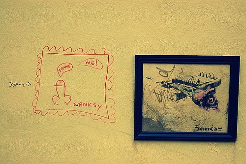
Bored of Banksy...


There is nothing quite like fame to influence how we interpret art... apart from perhaps knowing how much it cost. The problem with the former is that reputation often has little to do with the actual quality of what is perpetrated in the name of art. Often indistinct and always inescapable, our obsession with artists personal history and reputations distort, and sometimes positively obstruct, the way we see.

Our at once both clingy and contentious relationship with Banksy is a perfect case in point. He’s been floating high on his vast profile, inflated by huge belches of hot air from the media and middle class, for a decade or so.

The problem is that his profile is several time more interesting than his art. At the core his art actually has very little substance. When you’ve identified the, frankly not very well concealed, tropes it can - a bit like a Terry Pratchett novel - get a tad boring. Think about your favourite Banksy piece and count off these factors: It’s dependent on simple visual gags, a peripheral understanding of some basic art concepts and a rather churlish teenaged set of politics.

On the street Banksy catches the mainstream audience eye because the works sit in a context of street painting that is still essentially highly exclusive, expressly holding meaning for a tiny marginal group of people, and, unlike Banksys, has little regard for traditional aesthetics. To 99% of the population graffiti is the kingdom of the blind, Banksy just happens to be the one eyed man.

That doesn’t mean he’s up to sitting at the proverbial grown up table. In the gallery or the print fare he is like a clever teenager who’s been allowed to stay up past his bedtime. His gallery works are almost comforting in the way they both manage to be ever so clever and yet cleave to the well established Banksy form. They only hold our attention because of his reputation, because we are all the artistic equivalent of rubber neckers at a grusome car crash. We look to Banksy because we want that tart taste of controversy and novelty. However, when he hold so closely to form, surely whatever controversy his exhibitions might hold quickly disperses? What is exciting about art that always manages to perfectly meet our expectations?

If you look at his original print works, and the prices they fetch in the auctions and print fares, it becomes pretty clear that he is simply replicating one aspect of Warhol’s career without one ounce of Warhol’s brilliance. More so than Warhol, Banksy proves variations on a theme can only be applied for so long before becoming insufferably stale.

So although Banksy is still consistently popping up in the news - images appearing over night on walls all over the world, purchased at some ridiculous price by whatever celebrity we are supposed to idolise now, jealously being vandalised or white washed over by thick thumbed councils - isn’t it time we got over him? Come on! lets all makes a critical resolution for the New Year and try from now on to extract the artist’s reputation from the art and actually look at what is in front of us?

You liked this! It was published in The Blog Paper No. 3

Image by Walt Jabsco used under a Creative Commons Licence - check it out on Flickr 

Monday, 18 January 2010

Aubrey Williams: Atlantic Fire @ Walker Art Gallery

Does great art need to defy or define the period it was created in?

When mooching in the Walker Gallery, it's always hard not to stop and gaze at the Turner located just by the glass doors to the Special Exhibitions . A shimmering, gleaming seascape, it is both a magical abstraction and a perfect evocation of an effect of heat, light and water.

Turner is basically the definition of great art, so it's both tempting and slightly cruel to compare anyone to him. However, I've found it difficult not to dwell on this comparison when visiting the recently opened Aubrey Williams: Atlantic Fire.


Aubrey Williams, Hymn to the Sun IV, photographs from National Museums Liverpool flickr page.

Aubrey Williams' paintings are both very beautiful... and somewhat kitsch. What stops them being sublime is an unfortunate combination of muddy and electric colours which lends them a certain 80s air. I know this is an inherently ridiculous criticism, but it bothers me. Where I want his miasmic coral like colours and forms to shimmer and billow, there is an rubbery quality somehow reminiscent of marbled paper.

But can I really criticise paintings made in the 80s for looking like products of their time? I feel uncertain on this point. At the end of the day, not everyone can be Turner.

Wednesday, 13 January 2010

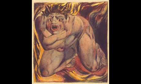
Reinventing William Blake

‘And who was this William Blake? A wild sort of painter, was he not; or a poet of some kind; and at any rate, a strange sort of man?’*


Blake, Blake, Blake. If he's the archetypal British artists it seems to be at the expense of so many other British artists throughout the ages.

The problem for rabid art bitches like me is that you can't dismiss the man. Although mired in a sea of preconceptions and substantial accusations of Blake's paucity of theory, skill and sanity, his contortion of the human form and mangling of the British language are rather exciting. Perceived in so many ways to be the teenaged pinup of a mad artistic genius, this authorship of the man in the most offensive thing about him.

Just as the Frida Khalo we know is a creation of second wave feminist art history, William Blake was created by the Victorian generation that followed him. The smoothing of Blake's hymns into the form of Jerusalem we know now took place in the Edwardian period and can be directly traced back to the work of Blake's Victorian lobbyists.

The Tate's purchase of 8 prints, some of them only exhibited once before, will be getting the teenager in every art fan tumescent.  But it's also bringing out a lot of tired truisms and urban legends about the man. I would not argue that we should attempt any impossible mission into the impenetrable mists of time to discover the "real Blake", just perhaps accept a slightly more tempered approach to the man.

At the end of the day, is it really acceptable that respected and widely circulated sources such as the Guardian air the largely dismissed fantasy that Blake "sat naked in his London garden with Catherine, emulating what he saw as the lost innocence of Adam and Eve" as fact?

*John Camden Hotten caricaturing general public understand of Blake in, Review of ‘William Blake; A Critical Essay’, Illustrated Review, 1:13 (1871:Apr.), 436.

Tuesday, 12 January 2010

Rothko's Seagram Murals @ Tate Liverpool

It may be old news, but there is something magical about Rothko's Seagam Murals. Although magical is not quite the right word, it's too light and sparkly for a sequence of works which are muscular, dense and crackling with some serious psychological juju.

I've never been a fan of the Tate Modern in it's current form, it's a big ugly, hard edged, over branded art box. But, when I lived down south I used to almost religiously visit the murals, which, like Chris Ofili's wonderful The Upper Room, are dripping with a powerful cloistral quality. You can't really look at these works, just point your face in the direction of the painting and bath your brain in their amazing hues and textures.

Now at the Tate Liverpool, a smaller, more colourful but still hard edged venue, The Seagram Murals have found a situation which is not only appropriate but even better than the Tate Modern. The industrial pillars, flagstone floor, gently vaulted roof lends a delicious industrio-spiritual flavour to what was previously simply a dimly-lit grey room.

A visit to see The Seagram Murals is like a visit to see an old friend... if that old friend is a succulent and slightly unsettling art experience.

Wednesday, 6 January 2010

Bleakest snow scenes? The Victorians did it best!

My intellectual crush on Jonathan Jones can only grow. What else can I do when his most recent blog resonates with my artistic interests even more than usual. However, I do have to disagree with his choice as the bleakest snow scene.

I’ve written more words than I care to think about scenes of ice and snow, spent months of my life studiously dissecting the representation of Victorian polar explorers. These silly men who set the trends for the equally silly Edwardian explorer Robert Falcon Scott have always fascinated me. The most famous and bloody of the Victorian explorers is John Franklin, who through being unprepared to the point of delusion managed to star in a story bursting with death, misadventure, cannibalism and powerful Victorian rhetoric. This gristly story left deep scars on the Victorian psyche, and these scars show in numerous snow filled paintings.

Mr. Jones picks a scene of massacre as his bleakest snow scene. It’s a powerful painting represented a horrendous scene, but can it really match the subtle, painful hints of disaster that appear in Landseer’s Man Proposes, God Disposes? Here Landseer makes masterful use of artistic techniques that we are more used to see manifesting themselves as nauseating Victorian pathos. Russell Potter wrote a brilliant blog post unpicking this interesting painting on Visions of the North.


Honourable mention must also go to Thomas Smith’s They Forged the Last Link With Their Lives in the National Martime Museum. (I’m not sure why they’ve changed the name of the piece since I wrote about it three years ago, since it categorically couldn’t represent Franklin). The painting shows the last surviving men of the ill fated expedition dead and dying in a bleak and hopeless tableaux. Unquestionably, when considering the now generally accepted accusations of cannibalism between the survivors, it does work as a piece of propaganda, but it also shows the end of an almost unimaginably terrible narrative.


For people in the North West looking for a scene of snowy bleakness which could rival the streets of Manchester, a trip to the permanent galleries in the Manchester Art Gallery might be in order. This time not about explorers, but about Napolean’s retreat from Moscow.  A narrative scene over flowing with the futility and bleakness of war, I find Adolphe Yvon’s Marshal Ney Supporting the Rear Guard During the Retreat from Moscow almost mesmerising. The detail is compelling, the moment when you notice the naked corpse - presumably stripped of his clothing by frost bitten comrades - is positively shocking.

So that’s it. Three paintings which both perfectly demonstrate the Victorian taste of macabre scenes set in frosty snow swept wastes and will perhaps lend a little context to our current snowy predicament!